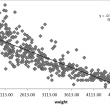
What is a Scatter Plot A scatter plot is a diagram to present the relationship between two variables of a data set. It consists of a set of data points set on two axis. On the scatter plot, a single observation is presented by a data point with its horizontal position equal to the value of […]
Archive | November, 2015
Histogram Rendering using SigmaXL
Histograms A histogram is a graphical tool to present the distribution of the data. These plots are used to better understand how values occur in a given set of data. The X axis represents the possible values of the variable and the Y axis represents the frequency of the value occurring. This graphical tool consists of adjacent […]
Box Plot with SigmaXL
What is a Box Plot? In statistics, graphical analysis is a method to visualize the quantitative data. Graphical analysis is used to discover structure and patterns in the data. The presence of which may explain or suggest reasons for additional analysis or consideration. A complete statistical analysis includes both quantitative analysis and graphical analysis. When […]
Pareto Analysis with SigmaXL
Pareto Principle The Pareto principle is an observation not a law. Named after Italian economist Vilfredo Pareto, this principle states that for a variety of situations, 80% of consequences come from 20% of the causes, thus the Pareto principle is also known as the 80/20 rule. The 80/20 rule basically reminds us that the comparison of […]