What is an EWMA Chart?
The EWMA chart (Exponentially-Weighted Moving Average Chart) is a control chart monitoring the exponentially-weighted average of previous and present subgroup means. The more recent data get more weight than older data. It detects the shift of the process mean from the process target over time. The underlying distribution of the EWMA chart is normal distribution.
EWMA Chart Equations
Data Point:
![]() where
where ![]()
Center Line:
![]()
Control Limits:

Where:
 is the mean of the ith subgroup
- λ and k are user-defined parameters to calculate the EWMA data points and the control limits
Use Minitab to Plot an EWMA Chart
Data File: “EWMA” tab in “Sample Data.xlsx”
Steps in Minitab to plot EWMA charts:
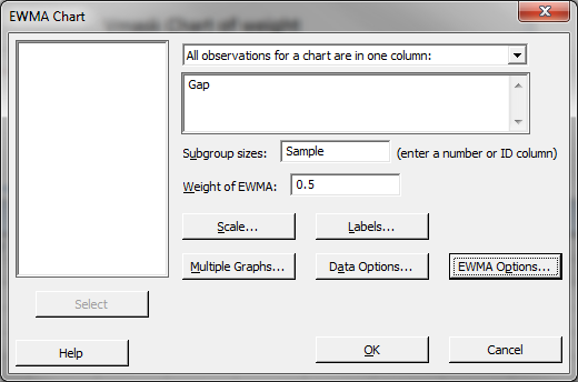
- Click Stat → Control Charts → Time Weighted Charts → EWMA.
- A new window named “EWMA Chart” appears.
- Select “Gap” in the box below “All observations for a chart are in one column.”
- Select “Sample” as the “Subgroup sizes.”
- Enter “0.5” as “Weight of EWMA.”

- Click “OK.”
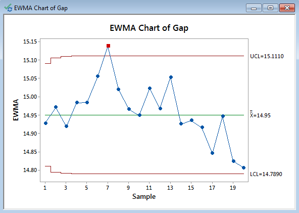
- The EWMA chart appears in the newly-generated window.

Model summary: One data point falls beyond the upper control limit and we conclude that the process is out of control. Further investigation is needed to discover the root cause for the outlier.


Comments are closed.