What is a CumSum Chart?
The CumSum chart (also called cumulative sum control chart or CUSUM chart) is a control chart of monitoring the cumulative sum of the subgroup mean deviations from the process target. It detects the shift of the process mean from the process target over time. The underlying distribution of the CuSum chart is normal distribution.
There are two types of CumSum charts:
- One two-sided CumSum charts
- Two one-sided CumSum charts
Two-Sided CumSum
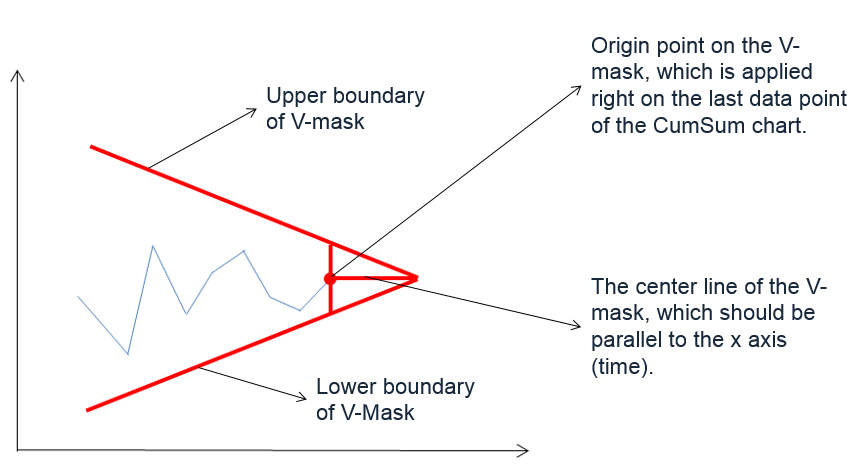
In two-sided CumSum charts, we use a V-mask to identify out-of-control data points. The V-mask is a transparent overlay shape of a horizontal “V” applied on the top of the CumSum chart. Its origin point is placed on the last data point of the CuSum chart and its center line is horizontal. If all of the data points stay inside the V-mask, we consider the process is in statistical control.
V-Mask
 The origin of the V-mask is the most recent data point, and the arms extend backwards. The process is out of control if any of the data points fall above or below the limits.
Two-Sided CuSum Equations
Data Point:
![]()
V-Mask Slope:
![]()
V-Mask Width at the Origin Point:
![]()
Where:
 is the mean of the ith subgroup
- T is the process target
- σ is the estimation of process standard deviation
- m is the subgroup size
One-Sided CumSum
We can also use two one-sided CuSum charts to detect the shift of the process mean from the process target. The upper one-sided CuSum detects the upward shifts of the process mean. The lower one-sided CuSum detects the downward shifts of the process mean.
One-Sided CuSum Equations
Data Point:
![]()
Center Line: T
Upper Control Limit:
![]()
Lower Control Limit:
![]()
Where:
 is the mean of the ith subgroup
- T is the process target
- σ is the estimation of process standard deviation
- m is the subgroup size
Use Minitab to Plot a CumSum Chart
Data File: “CumSum” tab in “Sample Data.xlsx”
Steps in Minitab to plot CumSum charts:
- Click Stat → Control Charts → Time Weighted Charts → CUSUM.
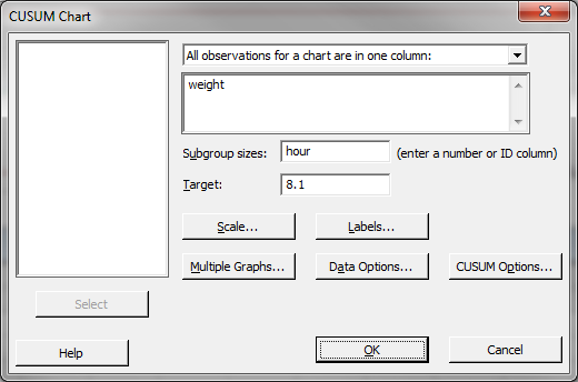
- A new window named “CUSUM Chart” appears.
- Select “weight” in the box below “All observations for a chart are in one column.”
- Select “hour” as the “Subgroup sizes.”
- Enter “8.1” as “Target.”

- Click the button “CUSUM Options” to open a window named “CUSUM Chart Options”.
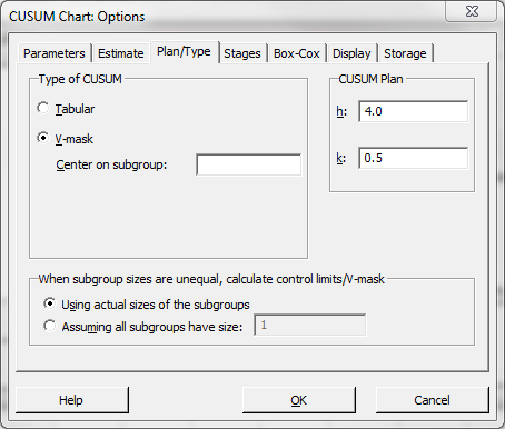
- Click the tab “Plan/Type”
- Select the radio button “V-mask”

- Click “OK” in the window “CUSUM Chart Options.”
- Click “OK.”
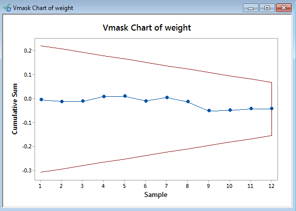
- The CUSUM chart appears in the newly-generated window.

Model summary: The process is in control since all of the data points fall between the two arms of the V-mask.


Comments are closed.