What is a Scatter Plot
A scatter plot is a diagram to present the relationship between two variables of a data set. It consists of a set of data points set on two axis. On the scatter plot, a single observation is presented by a data point with its horizontal position equal to the value of one variable and its vertical position equal to the value of the other variable. A scatter plot helps us to understand:
• Whether the two variables are related to each other or not
• What is the strength of their relationship
• The shape of their relationship
• The direction of their relationship
• Whether outliers are present
How to Use SigmaXL to Generate a Scatter Plot
Data File: “Scatter Plot” tab in “Sample Data.xlsx”
Steps to render a in SigmaXL:
1. Select the entire range of data (both “MPG” and “weight”)
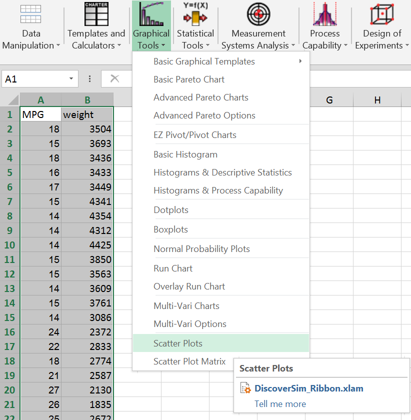
2. Click SigmaXL -> Graphical Tools -> ScatterPlots

Fig 1.0 SigmaXL > Graphical Tools > Scatterplots
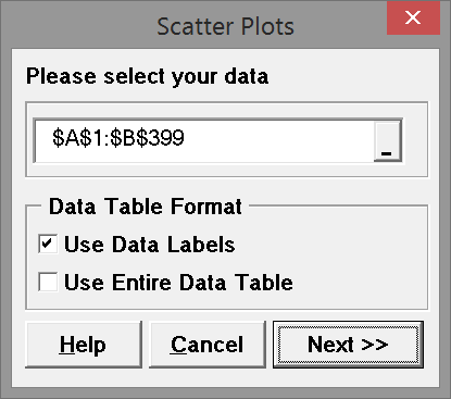
3. A new window named “ScatterPlots” pops up with the selected range of data appearing in the box under “Please select your data”

Fig 1.1 Data selection box
4. Click “Next>>”
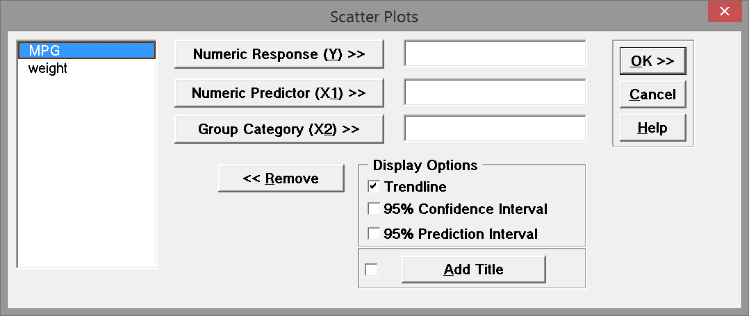
5. A new window also named “ScatterPlots” appears

Fig 1.2 Variable selection box
6. Select “MPG” as the “Numeric Response (Y)”
7. Select “weight” as the “Numeric Predictor (X1)”

Fig 1.3 Selection box with variables selected
8. Click “OK>>”
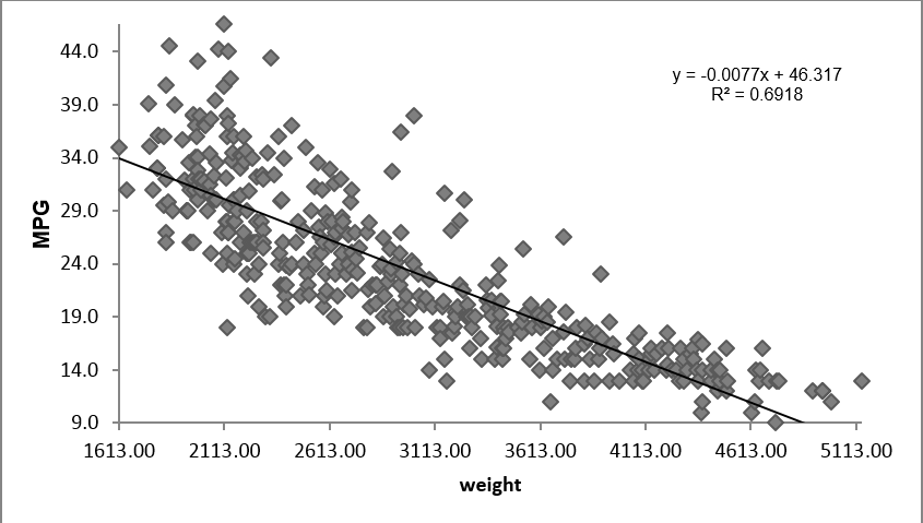
9. The Scatterplot appears in the new tab “Scatter Plot (1)”

Fig 1.4 Scatterplot Results
Figure 1.4 is SigmaXL’s output of the data. You can immediately see the value of graphical displays of data. This information obtainable by viewing this output shows a relationship between weight and MPG. This plot shows that the heavier the weight the lower the MPG value and vice versa.


Comments are closed.